Any design that accommodates the F and E patterns our eye movements have become accustomed to when browsing the web is an attractive layout. So what makes for the most effective yet attractive website design? The best way is to test similar designs and find out which has the best performance among your visitors. There is no “one-size-fits-all when it comes to finding the most attractive website designs for you and your visitors, however, we can start with the most successful examples and work from there.
Attractive Website Designs Are Visual & Spacious
Some businesses don’t need much explaining or introduction if they’re smart with their titles and images. These businesses have only a few products or services to sell.
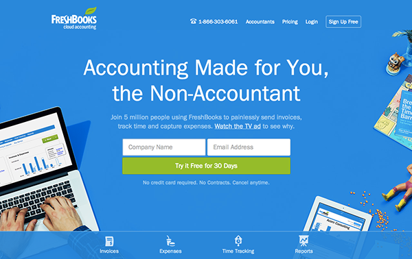
Fresh Books
Notice how the green button stands out? I wonder what their results would be if they changed the button colour to red. With very little content, visitors are focused on the green button and the headline first. From these two elements they have a good understanding of what this page is about in under 5 seconds. By using bold formatting, the web designers increased and decreased priority reading. Notice the desktop to the right has a screenshot of the software. This is a much trendier alternative than describing what the software looks like in text along with images of the software.
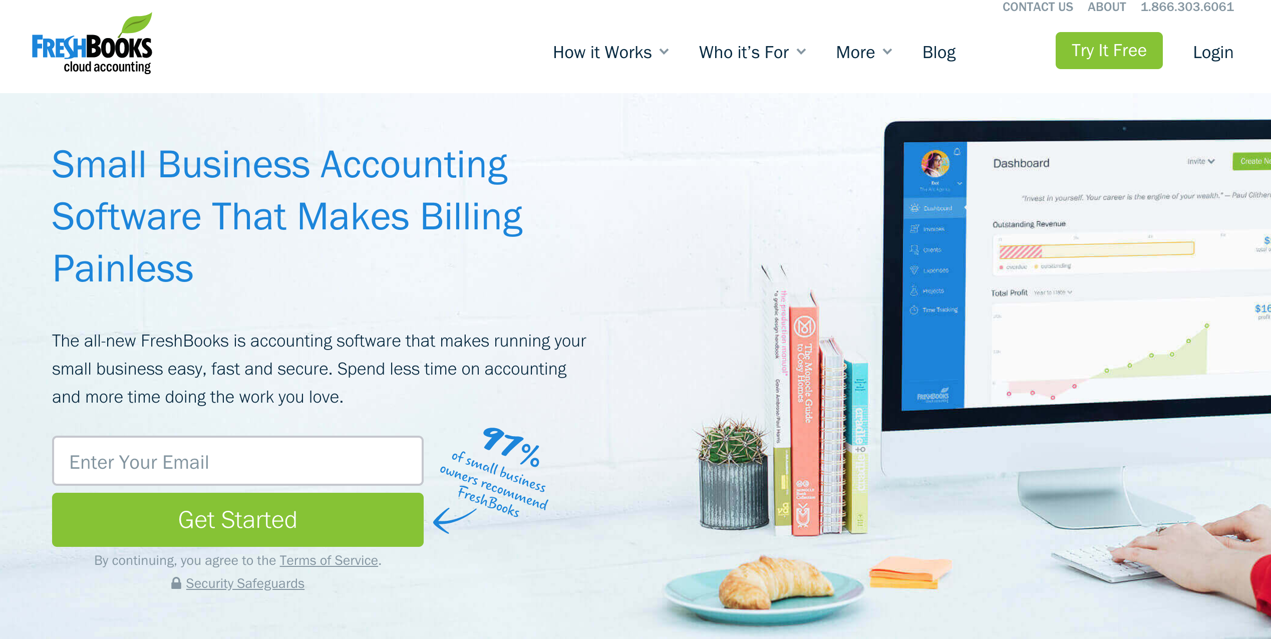
This layout is spacious and easy to consume. This may be first on our list of attractive website designs but that doesn’t make it anymore important.
Mint
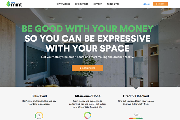
When visitors enter a website, they already have questions in their mind. Mint asks those common visitor questions before answering them. This helps build trust with the visitor as you know exactly what is they are looking for and they are very comfortable with that. The background image makes the text easy to read but maybe it could be more relevant to the business and help explain what you’re signing up for. This image may be more successful as it suggests you will have the expensive items like this if you manage your money with Mint, however, it’s definitely an area to test and explore.
Free is the most powerful word in the English dictionary. Use it wherever possible like they did with “Sign up free”.
eWedding
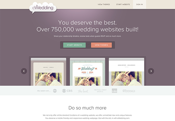
The homepage isn’t cluttered and only includes the essentials to help visitors get started on building their website. The call-to-action buttons are clear, crisp and concise. No confusion or friction whatsoever.
Attractive Website Designs That Are Content Rich
On the contrary, some businesses provide many products and services in their industry. So how do we ensure visitors won’t lose focus and feel overwhelmed?
Whitehouse.gov
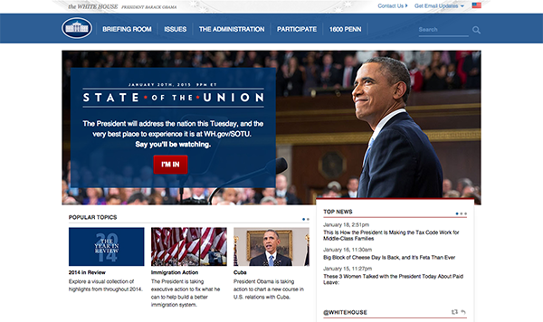
With a lot of topics to cover the Whitehouse website has broken it down into Popular Topics and Top News as visitors won’t be as motivated to sift through lots of news and topics. A large banner image is still used despite the amount of information that needs to be displayed. This is an opportunity to showcase your most popular product or service. Search boxes aren’t used often for good reason but for a big website it is mandatory so visitors can find a specific accreditation or something that’s important to them.
3 Key Takeaways To Having An Engaging Website
- Write short, descriptive headlines. No more than 4-5 words.
- Point visitors to your call-to-action by having it as the main focus of the page.
- Don’t give your visitors time to think. Make sure a 10 year old can understand what you are trying to convey.
We are aware that visual content increases conversions so start taking advantage of this trend now before your competitors do.
For further insights and guidance, we invite you to explore our blog at 07hm.co.uk/blog. Here, you’ll find a wealth of information tailored to the needs and challenges of SMEs navigating the digital landscape. Additionally, if you have specific questions or need personalised advice, don’t hesitate to reach out to us via email at info@07hm.co.uk or telephone on 01702 410663.


